Global River Data
Table of Contents
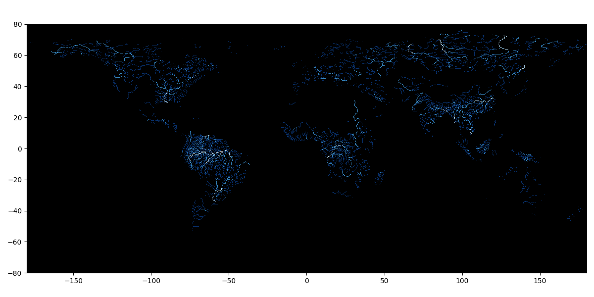
Figure 1: WWF HydroSHEDS Free Flowing Rivers Network v1. Only rivers corresponding to RIV_ORD values of between 1 and 4 inclusive, with increasingly dark shades of blue. Continents are not drawn, but they can easily be inferred from the beautiful structure of the river networks; likewise, arid regions are easily identified. The plotted lines do not take river width into account.
1. Introduction
For my second foray into Google Earth Engine, I decided to look at rivers, and in particular what I could do by combining the land cover data with rivers. Combining datasets opens up many new possibilities and the options quickly become overwhelming, so to keep things simple for now I aim to answer the following question: how have croplands changed near rivers over time? The question is perhaps too simple, because while it might give some indication of how productive land near rivers is, it cannot tell us whether the quality of the crops is better or worse, what kind of crops are being grown, or if the changes are compensated for elsewhere (e.g. near sources of groundwater). But it can give us an insight into changes in economic activity. If, for example, cropland near rivers disappears, what does that mean for the local farming population? what does it imply about the types of food being cultivated, or how that might affect markets? Since agriculture is often reliant on rivers, particularly in arid regions of the world, such as the River Nile in Egypt, radical changes in land use could be an indicator of a changing economic, and thus likely social situation. Of particular interest, if cropland is expanding upstream, what might that tell us about agriculture downstream, and in particular in neighbouring states?
The questions here are rather vague. We cannot hope to make economic forecasts, or geopolitical predictions, but since everything about human existence revolves around water, food and land, asking them might give insight into where we might expect to see changes as a consequence of how local economies respond to changes in both climate and neighbouring economies.
As before, this article is as much about using Google Earth Engine as the results, so I'll be discussing the technical aspects of the code as well as the data. I'll be producing maps and statistics, each product requiring its own approach.
2. Data
For the cropland I will continue using the MODIS data as before, which gives us 23 years of yearly estimates of land cover. Likewise, for the geopolitical boundaries I will continue to use the geoBoundaries data. For the rivers, I chose the WWF HydroSHEDS Free Flowing Rivers Network v1 dataset (Grill et al. 2019) mainly because of the permissible licence. The only downside when compared to some other datasets available in GEE is that it was derived from a single year's data, so it will not represent changes in flow rate over time. Indeed, rivers can also change position over time, but not enough to worry me for the rather coarse statistics I will be calculating. River flow rate is seasonal, but long term trends would be worth exploring as they could represent climatic change, or change in usage upstream. I will defer this to a future test.
The key feature of the HydroSHEDS dataset for my purposes is the RIV_ORD attribute. The rivers are mapped according to their "long term average discharge" in cubic metres per second, subject to a logarithmic progression where the lowest numbers refer to the highest flow. Thus a discharge of 100,000 m3 s-1 or more is attributed the number 1, and a discharge of between 10,000 and 100,000 m3 s-1 is attributed the number 2 etc, down to the number 10 for discharges of less than 0.001 m3 s-1. A map of these rivers is shown in figure 1 for RIV_ORD values 1 through 4.
3. Yearly plots of land cover near rivers
We already know how to use the land cover data, so the additional steps will involve filtering to keep only cropland and masking it when it is further than a given distance from a river. The river data is contained in a feature collection where each feature consists of a LineString (a connected set of vertices tracing the path of a segment of river) with a set of properties, including the RIV_ORD attribute which we will use to filter with. These data are therefore different to the geometries and images we have been using up to now.
Since not all rivers are equal, we will only consider those above a certain discharge rate. This choice of where to draw the line is a little arbitrary, but the river networks quickly become so dense that the question of distance to a river becomes irrelevant. I tried this, and apart from the unreasonable computational load, if all rivers are mapped then even the Sahara appears to be richly served by rivers. Including these usually dry river beds is clearly absurd. As a first approximation I decided to set the cutoff at a RIV_ORD value of 4, corresponding to rivers with an average discharge of between 100 and 1,000 m3 s-1. My litmus test was that the Murray River should be included as it counts as a significant river in south-eastern Australia, serving as a source of water, a means of transport and a state border. Many other smaller rivers in the Murray-Darling basin, such as the Goulburn, count as its tributaries and are of fundamental importance in local agriculture, though are not big enough to be included at this cutoff value. A future refinement to this work could be to descend to the next level of discharge rates. The filtering is easy enough:
// Get rivers above a certain threshold
var bigrivers = rivers.filter(ee.Filter.lessThanOrEquals("RIV_ORD", 4))
To create the mask, I made use of the convenient distance function which applies to feature collections. It generates a double precision image where each pixel's value is a measure of its distance from the nearest point, line or polygon in the feature collection. We are not yet interested in every pixel's distance, but by supplying it a cutoff distance of 100,000 m, this will define our mask, since all values beyond the cutoff are masked off.
var river_distance = bigrivers.distance(100000)
Now we need to apply this image as a mask to the MODIS land cover data to isolate cropland within the cutoff. Because the MODIS data forms an image collection (consisting of one image per year) we need to create a function to map over each image. Here is the function definition and its evocation to the MODIS data, contained in the variable lcmode:
var mask_dist = function(image){
  var nearRiver = image.mask(river_distance)
  nearRiver = nearRiver.mask(nearRiver.where(nearRiver.neq(12), 0))
  return river_distance.mask(nearRiver)
}
var cropDistances = lcmode.map(mask_dist)
The first line in the function mask_dist takes the image and masks it using the river_distance image, such that only land cover values within the cutoff distance are preserved. The next line further masks off all land cover values that are not cropland using the where method: anything not equal to 12, which is the value identifying cropland in the MODIS LC_Type1 data, gets set to zero and is therefore masked. Now we could simply return this value and recover only cropland within 100 km of "big" rivers, but I have added an extra step, applying the mask back onto the river_distance variable. What this gives us is an image showing all cropland within 100 km of a "big" river plus its distance from the nearest river, an additional piece of information which will come in handy later.
The resultant image looks like figure 2 below.
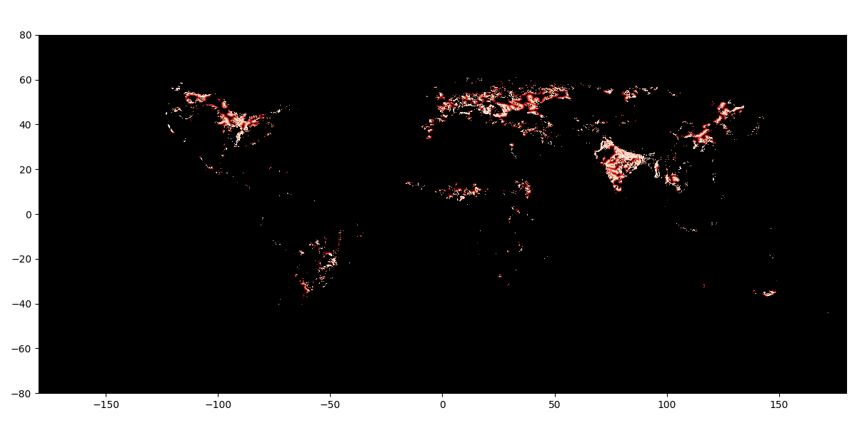
Figure 2: Combining WWF HydroSHEDS Free Flowing Rivers Network v1 and the MODIS LC Type 1 land cover data, showing only cropland located within 100 km of a river. The colour darkens with distance from a river. Only rivers corresponding to RIV_ORD values of between 1 and 4 inclusive. The image shown here is for 2022.
Though this reflects the river network displayed in figure 1, let's take a moment to consider it more closely. In particular, notice that India (and indeed Europe) is quite densely covered by cropland, meanwhile the Nile's banks comprise only a thin sliver of cropland. Zooming in we find that for most of its length, there is cropland only up to a maximum distance of about 10 km either side of the river. Now comparing with India is not an apples-to-apples comparison, since India's river network is much denser and, importantly, India is also much wetter, benefitting from the South Asian monsoon. But that is the point: despite having arguably the most legendary river known to western culture, which helped propel a powerful civilisation for millennia, Egypt's food and water supply is precariously dependent on essentially this one body of fresh water, whose source is in a distant, foreign land.
3.1. Aside: saving a series of images
I have produced a collection of images, each like that of figure 2, with one image produced per year of MODIS data. There is no convenient way to save an image collection, so we have to loop through each image in the collection and export each image individually. Normally in GEE this would be done with a function mapping, but we actually have to do this on the client, as this is where the export function operates, so a regular javascript loop is necessary. To loop over the image collection we need to convert it into a list first,
var listOfImages = cropDistances.toList(cropDistances.size())
The the loop is
var n = listOfImages.size().getInfo()
for (var i = 0; i < n;  i++) {
  var im = ee.Image(listOfImages.get(i))
  var datestr = im.get("system:index").getInfo()
  Export.image.toDrive({
    image: im,
    description: 'crop_distance_full_'+datestr,
    crs: "EPSG:4326",
    region: geometry,
    scale: 10000
  });
}
Note the use of .getInfo() to procure data from GEE into the client side, and the casting of each image from the list as an ee.Image object, the expected input to the Export.image.toDrive function. Loops like this are discouraged in GEE, but since this is a client-side operation there is no other option, nor does it pose any problem in terms of efficiency.
4. Statistics
The images produced in the last section can be converted into NetCDF files using, as I have, Xarray in Python, and exploited however one likes. While they might be interesting to look at, it is more useful to generate statistics for some quantitative analysis. This is best done within Google Earth Engine. To begin, we do much the same as for the script for the yearly maps by filtering the cropland within a threshold distance of the rivers with the distance method. Then, just as for the land cover statistics, we use reduceRegions to calculate statistics for a given region. This time I didn't just want a simple sum, I wanted to take advantage of the distance function attributed to the cropland pixels. It would therefore be nice to perform a sum for distinct distance intervals from the rivers. The ee.Reducer class includes histogram functions, of which fixedHistogram is the most appropriate for our needs. By predefining the intervals relative to the cutoff distance thusly,
var minDistance = 0
var maxDistance = 100000
var sliceWidth = 10000
var slices = (maxDistance-minDistance)/sliceWidth
we can construct a histogram through reduceRegions thusly,
var genHist = function(image){
  var histograms = image.reduceRegions({
      reducer: ee.Reducer.fixedHistogram({
      min: minDistance,
      max: maxDistance,
      steps: slices,
      cumulative: true,
    }).splitWeights(),
    collection: geolabFiltered,
    scale: 1000
  })
  return histograms
}
The splitWeights() method is used to weight the sums by the pixel area, and it requires some explanation, partly because it was unnecessary in the land cover sums from before (they were simply sums of pixels multiplied by area), but especially since the GEE Reference manual's description of it is so unhelpful:
Returns a Reducer with the same outputs as the given Reducer, but with each weighted input replaced by two unweighted inputs. (Google for Developers n.d.--a)
The Guide is slightly better, stating that
A reducer modified by splitWeights() takes two inputs, where the second input is the weight (Google for Developers n.d.--b)
But how those inputs should be arranged might not be clear to someone not used to GEE's paradigm, though it is simple enough: the weights, in this case the area per pixel, should be the second band in the image. There is no way to specify the band explicitly as an argument to splitWeights so this requires us to manually place the weight in that second position, if it isn't (as in my case) already. This too is easy enough, one simply selects the bands in the desired order. The generation of the pixel areas as an extra band is as before
var add_country_band = function(feature){
  return ee.Image.pixelArea().addBands(feature)
}
var riverDistArea = cropRiverDist.map(add_country_band)
And we select the bands with "area" second with
riverDistArea = riverDistArea.select(["distance", "area"])
We can now map the genHist function defined above onto riverDistArea and splitWeights() will do its job,
var hist = riverDistArea.map(genHist)
The end result is a histogram of land cover according to distance intervals from rivers, per country. I chose to do cumulative sums, and set the scale to 1 km. Here is an extract of the table with the cumulative areas as columns for each country, for every year of the MODIS data, where I've only shown the columns for distances up to 50 km from a river. Units are in square metres.
| shapeGroup | shapeName | year | 10000 | 20000 | 30000 | 40000 | 50000 |
|---|---|---|---|---|---|---|---|
| IRQ | Iraq | 2001 | 14539613522 | 25185212387 | 31951492772 | 36890334426 | 40757415808 |
| IRL | Ireland | 2001 | 118540933 | 314010840 | 607583612 | 991345647 | 1250515223 |
| KAZ | Kazakhstan | 2001 | 3160391855 | 7043131191 | 10811377877 | 13728018211 | 15736434625 |
| KEN | Kenya | 2001 | 1494156322 | 2366870586 | 3544441330 | 4781636392 | 5805470273 |
| PRK | Korea, North | 2001 | 4582730332 | 9303096326 | 13100694731 | 16642759101 | 20110070920 |
| KOR | Korea, South | 2001 | 3887985243 | 6787127149 | 9471448552 | 12012928405 | 14073946008 |
Of course these statistics are most interesting when viewed as a function of time. Seeing as we've discussed it, let's look at Egypt's statistics for the full period.
| year | 0 | 10000 | 20000 | 30000 | 40000 | 50000 | 60000 | 70000 | 80000 | 90000 | total | countrywide |
|---|---|---|---|---|---|---|---|---|---|---|---|---|
| 2001 | 9186 | 3768 | 2300 | 2151 | 1935 | 1944 | 1631 | 1391 | 1179 | 976 | 26465 | 27143 |
| 2002 | 9229 | 3786 | 2305 | 2160 | 1950 | 1950 | 1641 | 1378 | 1196 | 981 | 26582 | 27271 |
| 2003 | 9220 | 3808 | 2307 | 2152 | 1922 | 1939 | 1629 | 1386 | 1206 | 988 | 26561 | 27287 |
| 2004 | 9187 | 3790 | 2302 | 2156 | 1913 | 1930 | 1623 | 1403 | 1207 | 988 | 26504 | 27229 |
| 2005 | 9157 | 3760 | 2294 | 2148 | 1911 | 1925 | 1618 | 1404 | 1214 | 997 | 26431 | 27204 |
| 2006 | 9158 | 3761 | 2298 | 2149 | 1907 | 1932 | 1625 | 1405 | 1216 | 1004 | 26460 | 27281 |
| 2007 | 9183 | 3789 | 2299 | 2135 | 1895 | 1933 | 1621 | 1390 | 1214 | 1005 | 26468 | 27296 |
| 2008 | 9223 | 3846 | 2313 | 2136 | 1901 | 1940 | 1621 | 1400 | 1218 | 1017 | 26620 | 27483 |
| 2009 | 9278 | 3899 | 2323 | 2150 | 1909 | 1939 | 1630 | 1412 | 1222 | 1026 | 26795 | 27705 |
| 2010 | 9274 | 3889 | 2318 | 2148 | 1906 | 1945 | 1636 | 1406 | 1234 | 1034 | 26792 | 27706 |
| 2011 | 9311 | 3907 | 2325 | 2153 | 1918 | 1942 | 1652 | 1408 | 1230 | 1046 | 26896 | 27821 |
| 2012 | 9336 | 3951 | 2357 | 2180 | 1961 | 1961 | 1678 | 1420 | 1231 | 1041 | 27120 | 28091 |
| 2013 | 9353 | 3987 | 2381 | 2194 | 1980 | 1972 | 1693 | 1457 | 1241 | 1047 | 27310 | 28334 |
| 2014 | 9346 | 4005 | 2380 | 2190 | 1961 | 1972 | 1707 | 1461 | 1246 | 1050 | 27322 | 28385 |
| 2015 | 9318 | 4011 | 2383 | 2179 | 1960 | 1973 | 1715 | 1460 | 1252 | 1052 | 27307 | 28301 |
| 2016 | 9327 | 4053 | 2380 | 2193 | 1988 | 1973 | 1714 | 1467 | 1268 | 1060 | 27428 | 28476 |
| 2017 | 9332 | 4089 | 2385 | 2195 | 1992 | 1974 | 1718 | 1472 | 1268 | 1059 | 27488 | 28560 |
| 2018 | 9335 | 4115 | 2401 | 2204 | 1994 | 1974 | 1714 | 1491 | 1275 | 1062 | 27571 | 28646 |
| 2019 | 9373 | 4170 | 2417 | 2226 | 2006 | 1994 | 1728 | 1510 | 1277 | 1069 | 27775 | 28850 |
| 2020 | 9430 | 4216 | 2442 | 2242 | 2020 | 2001 | 1733 | 1523 | 1296 | 1079 | 27986 | 29134 |
| 2021 | 9429 | 4228 | 2441 | 2249 | 2019 | 1992 | 1730 | 1512 | 1297 | 1083 | 27982 | 29119 |
| 2022 | 9417 | 4233 | 2433 | 2240 | 2015 | 1992 | 1735 | 1496 | 1295 | 1081 | 27941 | 29101 |
| 2023 | 9460 | 4268 | 2450 | 2239 | 2027 | 1998 | 1734 | 1526 | 1310 | 1096 | 28113 | 29320 |
I've converted the units from metres (for the distance labels) and square metres to kilometres and square kilometres. Each column shows the surface area of cropland for the 10 km interval starting at the column's heading, so the first column shows the area up to 10 km from rivers, the second between 10 and 20 km and so on. The "total" column is the sum of all other columns, and the "countrywide" column shows the total land cover for all of Egypt, whose calculation was discussed in the previous article. We can more easily read this as a plot where we subtract the 2001 value from each column.
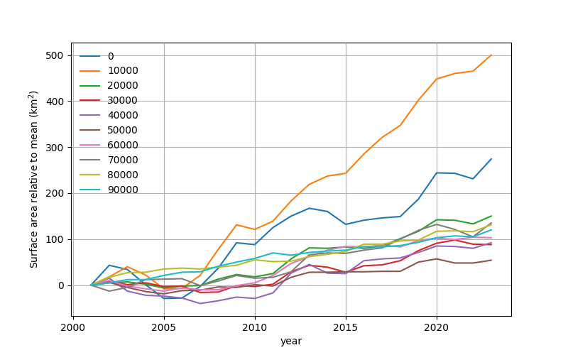
Figure 3: Egypt, change in surface area for each distance interval over the MODIS data period, where from each distance interval I have subtracted its value in 2001 to show its absolute increase.
This gives us an indication of each distance interval's total gain and rate of change. It shows that over the 22 years of the MODIS data, cropland increased in surface area in every one of those intervals, and that indeed most of the cropland is within 100 km of the Nile or its Delta. Some caution should be exercised in interpreting exactly how much lies outside the 100 km limit, since recall that we have only measured from large rivers, and it is entirely possible that many small streams are used for crop irrigation. It is also possible (and indeed a quick visual verification bears this out) that the cropland outside the 100 km limit is still close to it. By consulting a map, we find that most of the cropland is in the Delta. Either way, the proportion outside the limit (comparable to the last few intervals) is small enough that it won't have a major effect on the conclusions we derive. I'll come back to the Delta, because although much of it is criss-crossed with canals, these canals do not all show up in the river data.
The greatest increase in cropland is in the 10–20 km interval. This reflects two things: that land close to the river is more valuable cropland (easier to irrigate), but also that the land closest to the river is probably saturated. Indeed, from the table we see that the number of square kilometres of cropland in the interval closest to the river is well over double that of this second interval even at the end of the period, and that the second interval comprises almost a third of the total increase up to 100 km. It is interesting to find that some intervals actually lose substantial amounts of cropland at various periods. This could be because the land is temporarily devoid of crops or for some reason the signature is unclear and fools the data processing algorithm, or alternatively the land is put to use for something else and later on new cropland is opened up. Without looking at the satellite images in detail this is not possible to ascertain.
Let us leave aside for a moment the question of distance to major water ways, whose application is, admittedly, limited. There are many reasons to release more land for agriculture: economic incentives to produce more agricultural products, such as for export, or to compensate for possibly less reliable growing seasons in a changing climate. There are also several factors that may contribute to the feasibility of generating more cropland, such as improved water management, increased fresh water transport by the Nile, more access to labour or more efficient farming techniques. But next to these incentives we must give centre stage to Egypt's positively exploding population—from the beginning to the end of the MODIS data period it increased from around 70 million to approaching 120 million, and it is currently climbing by about 2 million people per year (World Population Review n.d.). The relatively modest increase in cropland, about 8% from 2001 to 2023, on its own would not be sufficient to feed these extra people, so either the farming would have to have become much more efficient, or the import–export relationship would have to have changed substantially; or perhaps a combination of the two. It seems unlikely to me that farming efficiency has increased that much in just 22 years, so the economic and social implications of this increase are dramatic. With the population set to increase still further, Egypt is certainly facing some challenges. But if the current landscape is anything to go by, with all the cropland (and population) thus far being concentrated so close to the Nile, and moreover dependent on it as the only major supply of fresh water, it would appear that expansion of food production will be among the greatest of these challenges.
4.1. The Delta's canals
Here's a nice reminder for why data should be treated with caution. When looking at the satellite images, we can see that there are canals carrying water throughout the Delta. Here is an example image taken from Google Maps of Abu Kabir, in the south-eastern part of the Delta, about 80 km from Cairo,
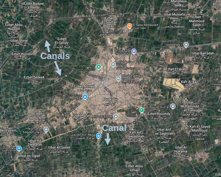
Figure 4: Abu Kabir, annotated screenshot from Google Maps.
I've annotated the map indicating some of the canals. Now look at the same area using our GEE river data, making sure to map all sizes of river.
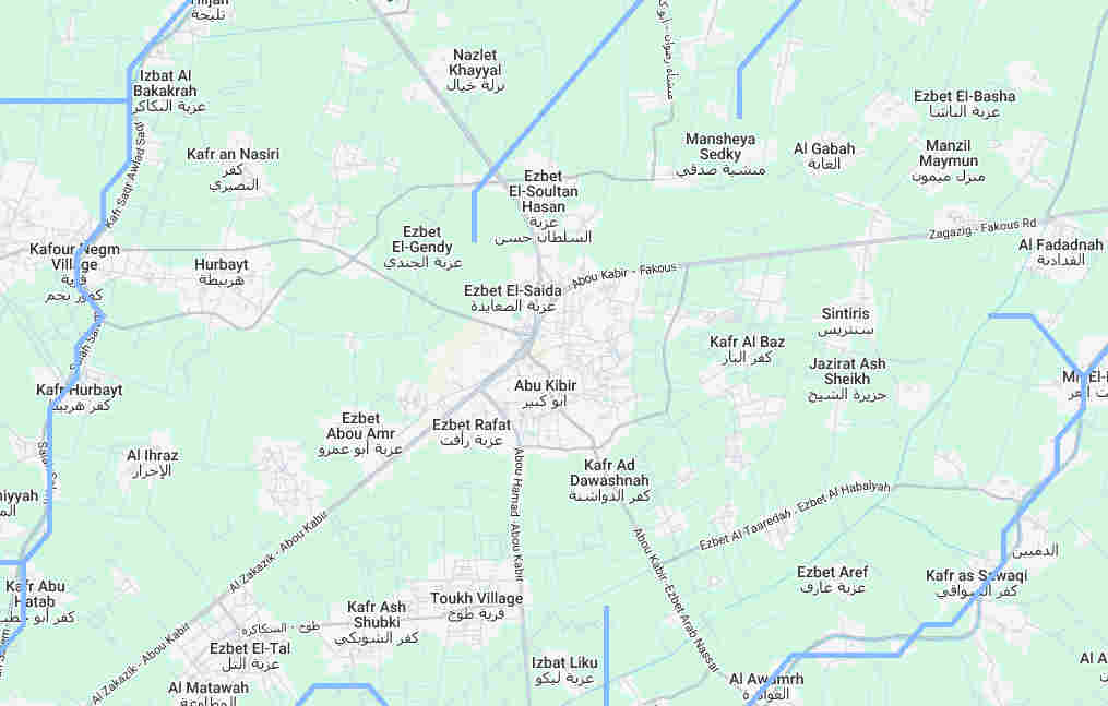
Figure 5: Abu Kabir and surrounds with rivers plotted. Rivers of all sizes have been plotted.
Those canals are missing—and worse than that, the "river" to the north, just west of Ezbet El-Soultan Hasan, doesn't appear anywhere on the satellite image! One wonders what else is missing, displaced or erroneously present. Happily for me, this isn't a study. It's even part of the point of these exercises to see what the limits of the data are, and to think about how to exploit them without falling into a trap. Happily enough, our statistics shouldn't be too badly affected since the density of canals is such that within the Delta we are more often than not within 10 km of a river.